///PROJECT_
///PROJECT_
LOGOS &
LOGOS &
LOGOS &
BRANDING
BRANDING
BRANDING
A collection of projects showcasing creative design for logos, brand identity, packaging,
A collection of projects showcasing creative design for logos, brand identity, packaging,
LOOKBOOK
RUPOSHI
RUPOSHI


client: RUPOSHI | SOUTH ASIAN APPAREL LABEL
PROJECT: LOGO, REBRAND
Established since 1998, Ruposhi was amongst the few places in St. Albans to cater to a minority community for South Asain casual and event apparel.
The company has since expanded onto the renowned South Asian fasion territories of London, Green Street and Luton, Bury Park. In 2020 they adapted for their online audience with the launch of their website - which is where I stepped in.
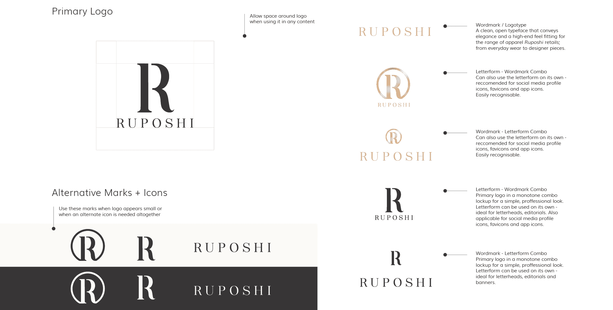
With this new launch, the owners wanted a fresh update for their logo, new digital assets to feature on their website and updated packaging to sit in line with their new look.
When designing for the rebrand I was sensitive to the rapport already bulit with customers so I bulit this styleguide off of their SIGNATURE core PALETTE of black and gold. My focus was to create a CONSISTENT image of elegance and professionalism that aligns more with the designer pieces they sell and elevates the store’s overall feel.
Although gold accents in print make for a really special consumer experience, my client also needed budget friendly options for production and so I worked into the second look with a stripped back letterform for a simple yet impactful execution.
client: RUPOSHI | SOUTH ASIAN APPAREL LABEL
PROJECT: LOGO, REBRAND
Established since 1998, Ruposhi was amongst the few places in St. Albans to cater to a minority community for South Asain casual and event apparel.
The company has since expanded onto the renowned South Asian fasion territories of London, Green Street and Luton, Bury Park. In 2020 they adapted for their online audience with the launch of their website - which is where I stepped in.
With this new launch, the owners wanted a fresh update for their logo, new digital assets to feature on their website and updated packaging to sit in line with their new look.
When designing for the rebrand I was sensitive to the rapport already bulit with customers so I bulit this styleguide off of their SIGNATURE core PALETTE of black and gold. My focus was to create a CONSISTENT image of elegance and professionalism that aligns more with the designer pieces they sell and elevates the store’s overall feel.
Although gold accents in print make for a really special consumer experience, my client also needed budget friendly options for production and so I worked into the second look with a stripped back letterform for a simple yet impactful execution.
LOOKBOOK
SAMIHA YASMIN
SAMIHA YASMIN


client: SAMIHA YASMIN | ART PRINTS
project: LOGO, BRANDING, WEBSITE, PRINT PRODUCTION, PACKAGING
date: July 2021 - March 2023
This was a personal project of mine when freelancing for the first time. Doubling as a portfolio and an e-commerce platform to sell my illustrations on.
although now dormant since moving on from freelancing, It was an exciting experience filled with many learnings!
The PICTORIAL mark I designed is actually a jasmine flower that represents the meaning behind 'Yasmin'. One thing I really love are collages - So I very naturally leaned into a scrapbook look and feel here with a scrawly handwritten typeface, brush stroke motif (a subtle tie into my background in art) and coffee stains! A very cozy, warm and authentic AESTHETIC.
client: SAMIHA YASMIN | ART PRINTS
project: LOGO, BRANDING, WEBSITE, PRINT PRODUCTION, PACKAGING
date: July 2021 - March 2023
This was a personal project of mine when freelancing for the first time. Doubling as a portfolio and an e-commerce platform to sell my illustrations on.
although now dormant since moving on from freelancing, It was an exciting experience filled with many learnings!
The PICTORIAL mark I designed is actually a jasmine flower that represents the meaning behind 'Yasmin'. One thing I really love are collages - So I very naturally leaned into a scrapbook look and feel here with a scrawly handwritten typeface, brush stroke motif (a subtle tie into my background in art) and coffee stains! A very cozy, warm and authentic AESTHETIC.


CLIENT: DUHA | ISLAMIC ART PRINTS
PROJECT: LOGO, BRANDING, WEBSITE, PRINT PRODUCTION, PACKAGING, original artwork
AN ONGOING PERSONAL PROJECT SERVICING IN BESPOKE ISLAMIC WEDDING (NIKAH) CERTIFICATES AND ART PRINTS.
THIS IS WHERE I KEEP MY FAVOURITE WORK. A MIX OF WHAT INSPIRES ME AND WHAT I LOVE TO CREATE.
SAMIHA YASMIN PORTFOLIO
SAMIHA YASMIN PORTFOLIO
SAMIHA YASMIN PORTFOLIO
SAMIHA YASMIN PORTFOLIO
SAMIHA YASMIN PORTFOLIO
SAMIHA YASMIN PORTFOLIO
SAMIHA YASMIN PORTFOLIO
SAMIHA YASMIN PORTFOLIO
SAMIHA YASMIN PORTFOLIO
SAMIHA YASMIN PORTFOLIO
SAMIHA YASMIN PORTFOLIO
SAMIHA YASMIN PORTFOLIO
SAMIHA YASMIN PORTFOLIO
SAMIHA YASMIN PORTFOLIO
© 2024 SAMIHA YASMIN.
DEEN FT. DUNYA